Can an Accessible School Website Be Beautiful, Too?
With OCR complaints on the rise, website accessibility is an urgent priority for many schools and districts. But do you have to sacrifice aesthetics to create a website that is accessible for users with disabilities? At eChalk, we believe you shouldn’t have to. Your school or district website should be both beautiful and accessible for everyone in your community.
When schools are faced with an OCR complaint or ADA lawsuit related to their website, the first reaction is often to simply strip away content and features that are flagged as accessibility issues. Many of the “accessible” templates from popular school website platforms take the same approach, offering a stripped-down version of a school website that lacks many of the features webmasters and the communities they serve have come to expect—such as tables, calendars and news feeds. Many of these accessible templates suffer from the “wall of text” phenomenon: instead of attractive, appealing pages that highlight the content well, these limited templates just allow you to put basic text content into a series of pages that all look the same. Many school website purchasers make decisions on a CMS provider based on their most visually appealing and interesting templates, only to find that the “accessible” templates offered are much more limited.
At eChalk, we take a different approach. Accessibility is built into the eChalk CMS from the ground up, so all of our school website themes are natively accessible. That means you can choose any eChalk theme and create a school website that is both attractive and accessible for everyone in your community. However, the final outcome—both in terms of accessibility and aesthetics—depends in large part on the choices webmasters and content creators make as they design their pages and add content.
Here are some tips for creating webpages that don’t sacrifice style for accessibility.
Choose the Right Colors
The right color combinations can make a huge difference both for overall visual appeal and accessibility for visitors with low vision. For best results:
Use consistent colors and font formatting across your site.
Make sure color contrast is high, especially between text and background colors. A bright, high-contrast design is appealing for all users and helpful for people with low visual acuity.

Maintain high contrast between text and background colors or images for maximum readability.
Add High-Impact Images
The images you choose for your site have a huge impact on the overall appeal of each page.
Bright, cheerful images that highlight your school facilities, activities and students will bring the site to life. Images that include people (especially students, with proper permissions) are usually the most visually interesting. Close-ups of individuals or small groups tend to be more appealing than large group shots.
Images look best when they stand alone in their own block on the page. If you would rather add images directly to a text block, put them on their own line and use center alignment.
Make sure you add alt-text to EVERY image on your site. Alt-text should describe what is in the image in clear and simple terms for people who cannot see it (e.g., “first grade boy drawing a pumpkin at a desk”). For the best user experience, the alt-text should not start with “picture of” or “image of”, and should not include the file name (e.g., “20200412_098.jpg”).

High-impact visuals in the banner image make the Queens Explorers website come to life.

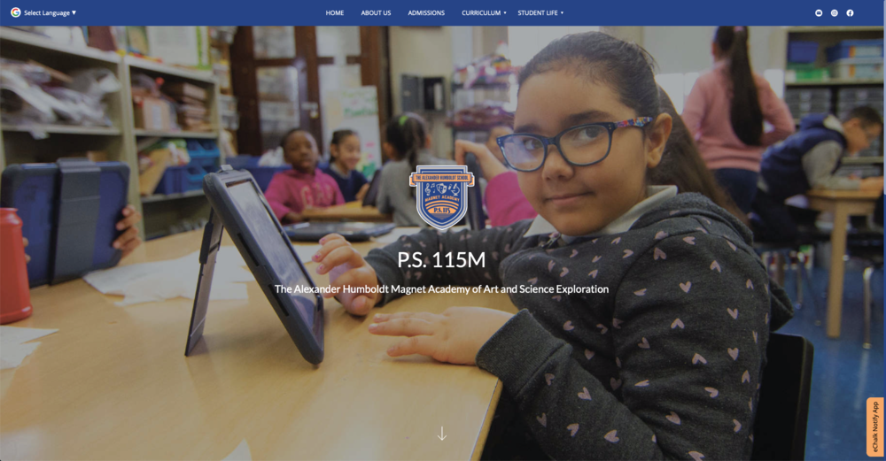
P.S. 115M uses images to showcase their special programs and draw attention to the text. Centering the image in its own line above the text in each block looks clean and professional.
Make the Most of Links
Using links correctly will go a long way towards improving the accessibility of your site. A series of links that simply say “click here” or “read more” do not provide the best experience for people relying on screen readers to navigate your site. To get the most from links:
Use descriptive link names (e.g., “Enrollment Forms” or “Lunch Menu”) that tell users what they will find on the other side of the link.
For maximum visual impact, consider using fun images or icons as links. For example, you can put the logo for your school district in a text block and make it a link to the district home page. If you are using images, make sure they clearly show what they link to and also use descriptive alt-text for people using screen readers. Pro tip: if a graphic extends to the borders of a file, try adding a little padding around it.
If you have a bunch of PDF files or other documents, put them in a links list on a page instead of linking to them individually in the navigation menu. The simpler your navigation items, the easier it is for users to find what they need.

Queens Explorers uses a table as a link list on their Academics page.

Emma Lazarus High School uses images as links on their home page. The broad border around each image and the contrasting color overlay with the link names make these links pop.

PS 115M uses icons paired with words in their links list for a clean, simple look that gives users multiple ways to engage.
Use Tables Wisely
Tables can be a great way to showcase content such as schedules, program options or menus. But tables are also one of the biggest barriers to accessibility if they are not constructed and tagged correctly. Make sure your CMS platform is able to support accessible tables; many do not. Here are some tips for creating simple and accessible tables:
When you create tables, make sure the header text is properly tagged so people using assistive software can understand and navigate the table. In eChalk, highlight the first row of cells in the table. Click on the table icon and select Cell > Cell Properties. Then, select "Header Cell" underneath the “Cell Type” dropdown.
Try bolding the text or using different cell background or font colors to make the header row stand out.
Make sure that none of your cells are merged; merged cells can create an unpleasant experience for someone using assistive technology such as a screen reader.
Try adding color to your tables! Even a light pastel background (with dark text) can be a fun addition. Be sure to pay attention to color contrast when you select your cell background and text colors.
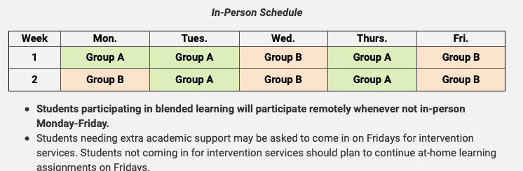
Adding color to this table draws attention to important information.
Other Content Considerations
The way content is laid out and presented on the page goes a long way towards both accessibility and visual appeal. Here are some additional tips for creating a page that is attractive and provides a great user experience for all website visitors.
It's helpful to break up large areas of text into small, easily digestible blocks on the same page. Think about how you can organize text so that it is easily scannable by sighted readers and people using screen readers or keyboard navigation can quickly navigate to the content they need.
Keep your content block titles brief. You can add more detail in the main body text of the block.
Make sure you're using your header tags (H1, H2, etc.) correctly. Each page should have only one H1 tag, which should describe the main function of the page (e.g., “Academic Programs” or “Parent Resources”). H2, H3, etc. tags should be used to divide the page into logical sections and subsections, so people using assistive technologies can understand the organization and structure of the page. Header tags should not be used simply to apply a style (such as a larger font) to a piece of text.

Organizing this page for Powhatan County Public Schools into blocks of text makes it easier for both sighted visitors and those using assistive technologies such as screen readers to quickly scan for the content they are looking for.
Here are some more accessibility tips for content creators:
Need help migrating to a more accessible school website platform? Ask us about our ADA Transition Package! We can get you set up with a beautiful, accessible school website in just 2 – 3 weeks, with minimal stress for your staff.